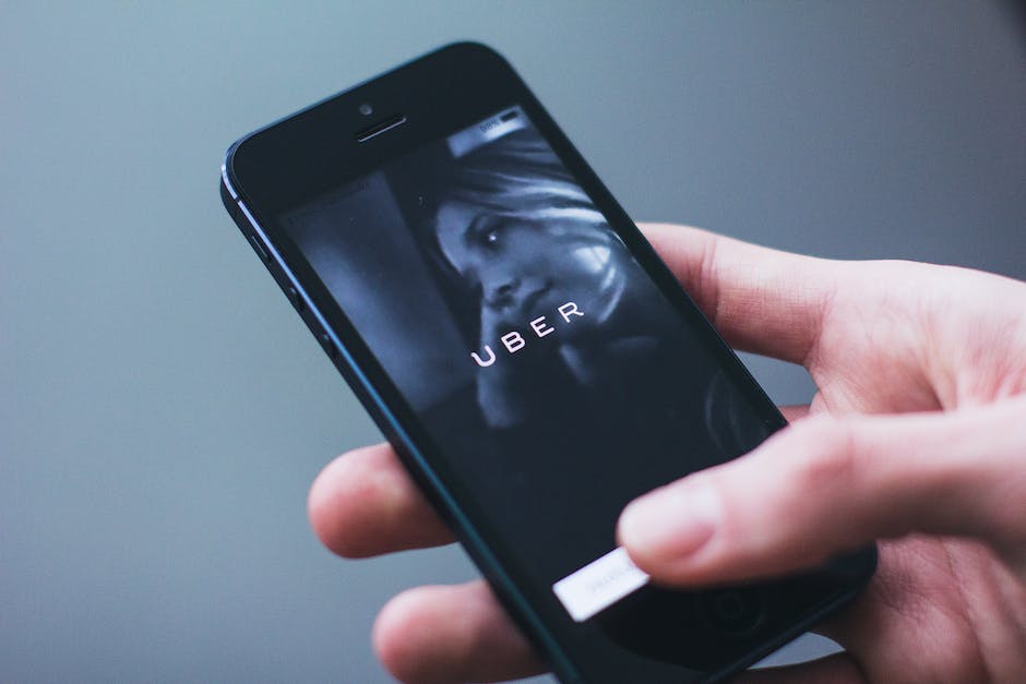
Uber has unveiled a major redesign for its app, which includes a new homescreen, a personalized feed with live activities, and a dynamic island that allows riders to easily access information about their ride. The redesign is meant to simplify the app and make it more user-friendly.
One of the biggest changes to the app is the new homescreen, which now features a prominent search bar at the top of the screen. The search bar is intended to make it easier for users to quickly find a ride or food delivery option. The personalized feed, located just below the search bar, provides users with a stream of real-time information and personalized recommendations, including news about their favorite restaurants, live events, and promotions.
The dynamic island is located at the bottom of the homescreen and provides riders with quick access to their trip details, estimated time of arrival, and driver information. The island also allows riders to access the rating system, support options, and other important features.
The app has also been updated with new features designed to make the ride experience more enjoyable. For example, riders can now customize their ride preferences, such as the temperature and music, before they even request a ride. Riders can also use the app to send a message to their driver, letting them know where to meet them or providing any other important information.
In addition to these new features, the app now includes a dark mode, which is designed to be easier on the eyes and reduce eye strain, especially at night. The new app is available for download on both iOS and Android devices.


